Case study
Incari Studio Interface
A redesign of the authoring tool Incari sold — a node-based platform for building automotive, industrial and smart-home interfaces. Its problem was not missing features. It was that nobody could find the ones it had.
- Client
- Incari, in-house product
- Role
- SVP Design — Hands-on: research, design system, module redesign
- Timeframe
- Oct 2022 – Sep 2023
- Outcome
- A control set and design system behind ~40 editor views, shipped module by module
The problem
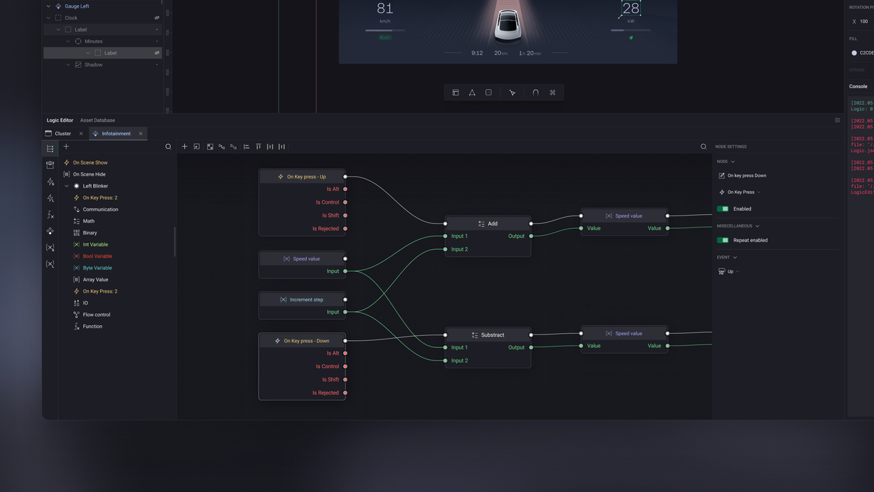
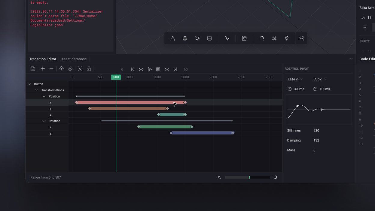
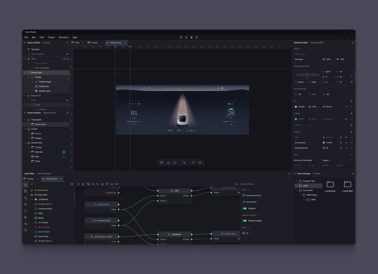
Incari Studio let people build working interfaces — car dashboards, appliance touchscreens, medical equipment controls — by wiring logic together in a node graph instead of writing code, mixing 2D and 3D and connecting it all to live data over CAN, MQTT or HTTP. It was a capable tool, and a tool designed by developers.
That showed in one specific way. The interface was built on an off-the-shelf Qt component library with hard limits on styling, which inverted the usual order of things: instead of deciding how an interaction should work and then building the control for it, the team decided what the available controls could do and shaped the interaction around that. Every screen inherited that constraint — and on top of it sat years of fast feature work with nobody looking at the whole.
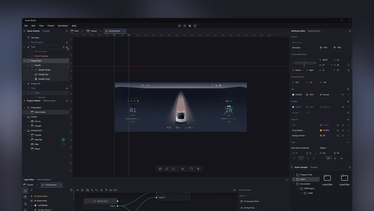
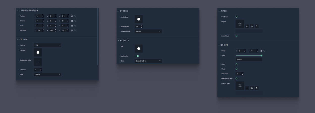
The Attributes Editor showed it worst. Select any object — a scene, a rectangle, a 3D mesh — and the panel exposed every attribute that object could possibly have, all at once: select a rectangle and the full drop-shadow parameter set appeared, whether or not the rectangle had a shadow. Finding one setting meant scrolling past dozens you didn’t want, and generous padding meant less fit on screen, so more scrolling.
It was never one panel, either. It was a composition: transformations, 3D transformations, pivot point, fill, stroke, effects, sprite, text, arc, mask and more — which submodules appeared depended on what you selected on the canvas. That combination is where the roughly 40 editor views came from. The same submodules also drove the Material Editor and the node attribute panels, and a Figma importer was on the roadmap, about to multiply the parameters each one would have to present.
That was the complaint customers actually made. Not “it looks dated.” That hunting through panels for one option wasted their time.
So the Attributes Editor was where to start: the tool’s most-used surface and its most repeated pattern, in the same place.
My role
I was SVP Design at Incari. Studio was our own product, so this was in-house tool work — no client brief to answer to, and no client budget to justify it either.
A product designer on my team started the redesign. When that changed, I carried it myself: research, strategy, the design system, and the module-by-module redesign.
The tool was Windows-only, with a macOS port planned but not shipped while I was there.
Key decisions
Align on the problem before drawing anything
Studio had plenty of functionality and poor usability. Rather than opening with mockups, I framed the discussion around the difference between utility and usability — utility is having the functions people need, usability is whether those functions can actually be used, and something is only useful when it has both. That treated UX as part of the product rather than a coat of paint, and it got design, engineering and product agreeing on the same problem. I wrote the vision they agreed to:
Deliver a software development platform that unlocks the potential of human creativity by minimizing technical complexities, and drastically shortens time to market by providing tools for building embedded systems and quick prototyping also for non-technical people.
The last clause is the one that did the work. Also for non-technical people is a usability requirement, written into the product’s goal — which made the redesign something the company had committed to, rather than something design wanted.
The strategy that came out of it set four principles: brand consistency, visual clarity, progressive disclosure and modularity. They weren’t decoration on the deck — each had to answer for a real decision in the product, and they had to be built in that order, because each one depended on the one before it.
Brand consistency — settle the foundation
A tool with an inconsistent UI can’t deliver a coherent experience, and Studio’s had drifted from everything else Incari put in front of customers. This had to be settled first: you cannot derive a control set without knowing what colour, weight and icon it will be drawn in.
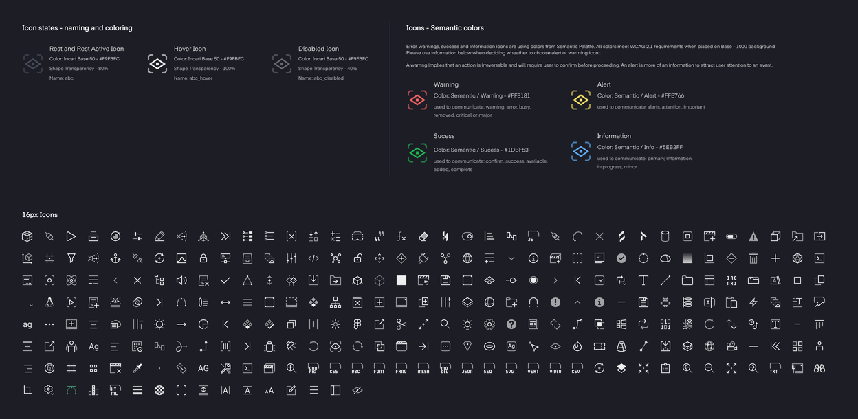
I rebuilt the foundation: a neutral ramp from Base-25 to Base-950 and a semantic palette — warning, alert, success, information — every colour clearing WCAG 2.1 against the product’s darkest background. The distinction between warning and alert got written down rather than left to taste: a warning means the action is irreversible and needs confirming; an alert is information asking for attention.
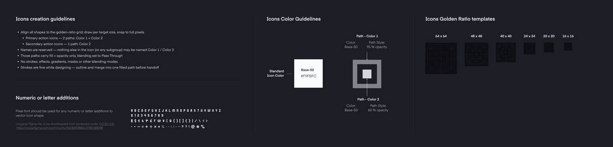
Then the icons, which is where consistency either holds or visibly fails — 371 of them, built to one construction standard so a single token drives colour and the three states are opacity values rather than three separate drawings.
Visual clarity — rebuild the controls
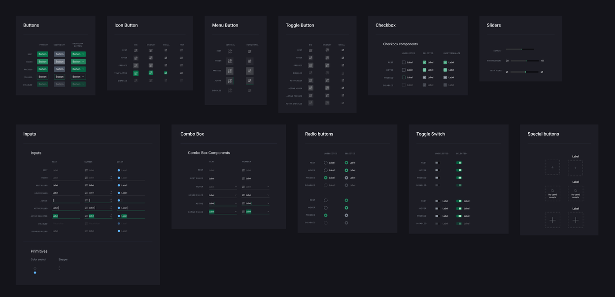
Neither clarity nor disclosure is something you can apply on top of a control set you don’t own — a compact row, an inline colour, a state that means there is more behind this all have to exist before anything can use them. So the controls came next, derived from the interaction each workflow needed rather than from what the Qt library happened to offer. Once they existed, every improvement made in the Attributes Editor — layout, component appearance, states — applied anywhere else in the product. That is the point at which this stopped being a redesigned panel and became a system.
Visual clarity — make the panel readable
“Make it cleaner” is not an argument anyone has to accept, so I didn’t make that one. Visual clarity is how effectively a design prioritises and conveys information, and there’s evidence for what it costs to get wrong: the more visual elements on screen, the higher the perceived complexity and the lower the perceived aesthetic quality — and interfaces judged clearer are also judged simpler.
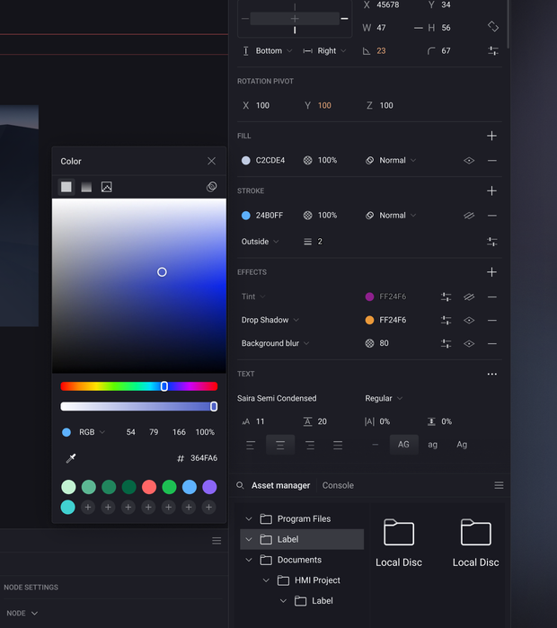
With controls of our own, the first thing clarity bought was room. The same panel, rebuilt to the new components, fits twelve more attribute rows on screen without hiding anything.
Progressive disclosure — show only what’s needed
Density alone doesn’t fix a panel that shows everything. A panel assembled from submodules can only be fixed submodule by submodule. Each one now shows its essential and default attributes and nothing else: drop shadow shows colour and transparency inline, and one click opens the full parameter set in a separate window. Less scrolling, easier to find things, and it worked equally well for both new and experienced users.
Style, end points, join and miter angle open in their own window instead of extending the panel.
Modularity — absorb new features without a redesign
Studio was always going to gain features — that was the company’s trajectory. A design system that only described what existed would have been obsolete on arrival.
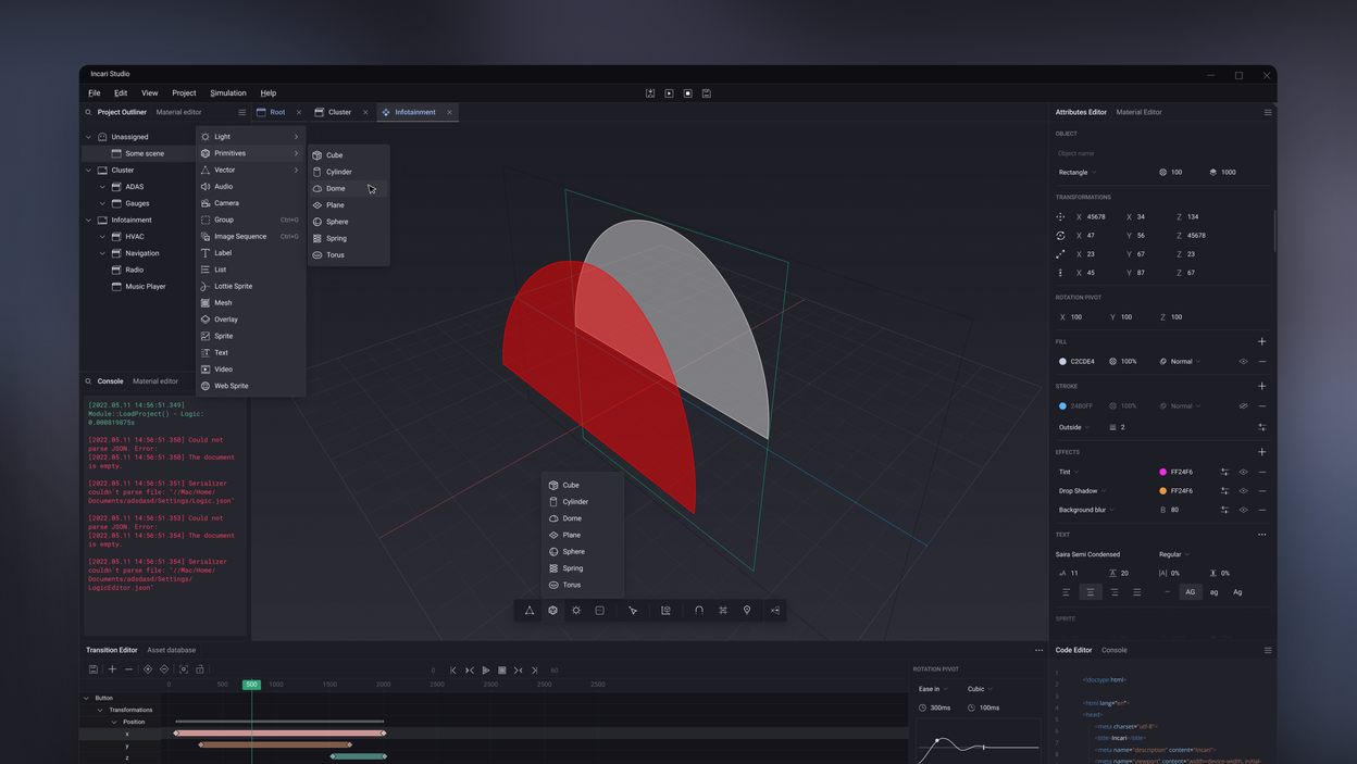
So the UI was divided into modules: self-contained units with defined interfaces, designed to be stacked, rearranged, reused, and recombined. That let the interface absorb new features without requiring a redesign each time, and meant the same treatment could work whether it held a scene outliner, a console, or something that didn’t exist yet. The order mattered: a system scales whatever you give it, so the standard had to come before repetition.
Modular layout is only half the system. The other half is how states are defined — not as a drawing for each state, but as rules applied to the layers every control already has. Each control uses the same stack: module background, background stroke, background fill, and content — the label and icon. States are then just a few values applied to that stack: hover raises the stroke to 15% opacity, active adds the fill at 15%, and disabled drops the content to 50% while leaving everything else untouched.
That’s what makes it scale. A state is a rule about layers, not a picture of a control, so it transfers to anything built the same way — a tree item, toggle, numerical input, or something not yet designed. No one has to invent what “disabled” means for a new component, or catch inconsistencies in review later.
Every state is the same few numbers on the same few layers.
How it shipped
Not in a release. In pieces, over more than a year.
The engineering team was small, and rebuilding modules is expensive work that produces no new features. A redesign delivered as one large project would have been refused, and would have deserved to be. So it went out module by module, riding the roadmap: whenever a module was being extended or improved for a feature reason anyway, the team rebuilt it to the new direction and the designs I’d provided.
That’s slower than a rewrite and it means living with an interface that’s half-old for a long stretch. It’s also the only version of this project that was ever going to ship.
Outcome
What shipped.
- Four design principles and five usability criteria, agreed with the team before anything was drawn — the reference every later decision was argued against.
- 371 icons at five sizes (64/48/24/20/16), on golden-ratio construction templates, each with normal, hover, active and disabled states.
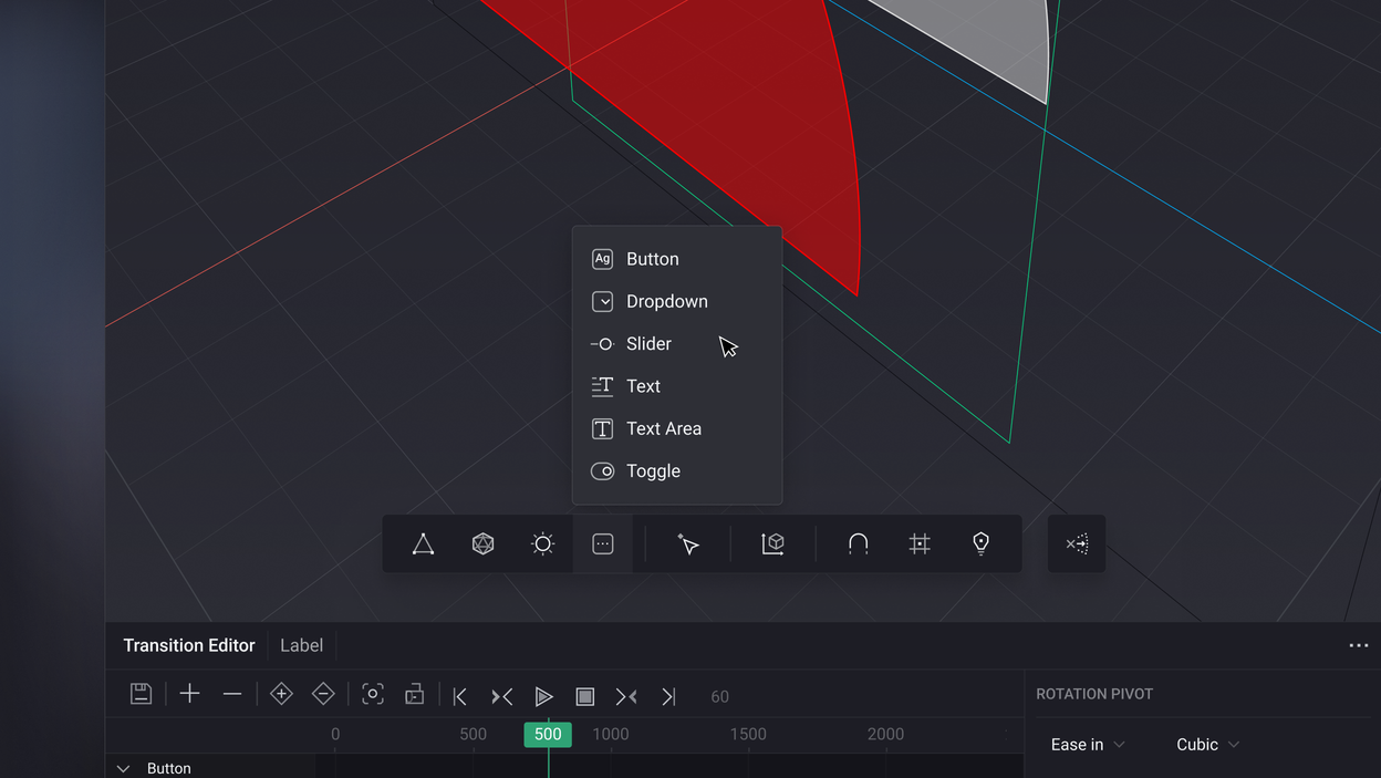
- A component set — icon, toggle and text buttons; tree-view and list items; checkbox, radio and toggle switch; numerical, string and colour inputs; primary and secondary tab bars.
- ~40 Attributes Editor views, assembled from one shared set of submodules rather than drawn one at a time.
- A state model — four layers and a few values, applied to every control, including ones designed after I left.
Those are scope numbers. They describe what was built, not what it moved, and the difference matters.
The feedback from our own HMI team was strongly positive — they were building concepts and client projects in a tool that no longer fought them. I won’t dress that up as a number. The team was small enough that any metric drawn from it would have been noise, and the redesign shipped module by module rather than as a release, so there was never a before-and-after moment to measure across. What I have is the qualitative version, and it was consistent: people stopped hunting for things.
That fed the business directly. Incari sold HMI projects built with Studio, not just Studio licences, and as time-to-market shortened and the output got better, more of those projects came in.
The redesign was still rolling out module by module when I left in 2025 — never a relaunch, just a tool that got easier to use every quarter, in a company that never had to stop shipping to allow it.
More from the project