Case study
Piëch Mark Zero HMI
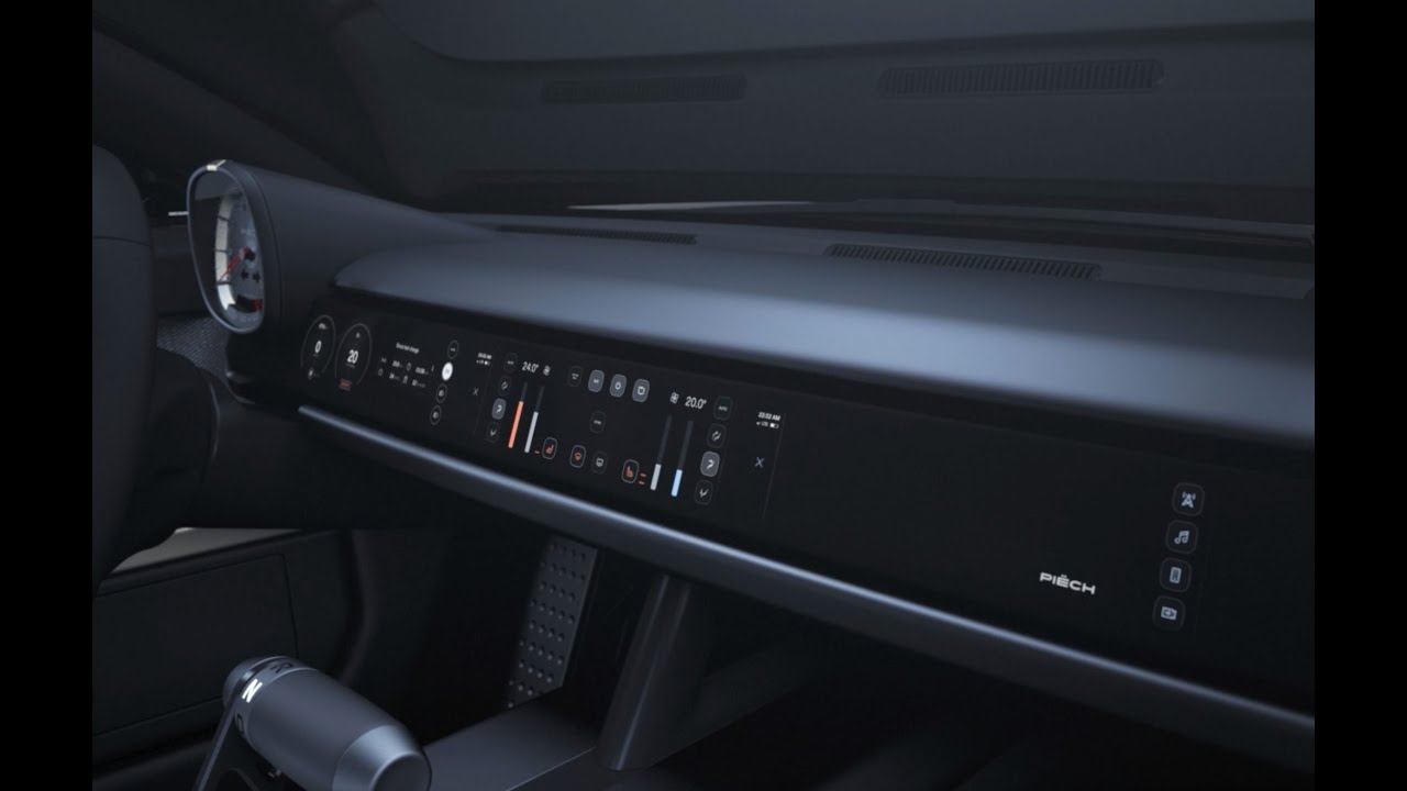
The in-car HMI for the Piëch Mark Zero electric sports car — a minimalist, driver-focused cockpit that won 1st place at the Car HMI Europe Awards.
- Client
- Piëch Automotive, via Incari
- Timeframe
- Oct 2021 – Jan 2022
- Role
- HMI design lead Visual direction, HMI, motion
- Outcome
- 1st place, Car HMI Europe Awards

The problem
Piëch Automotive was preparing to bring its first electric sports car to market and needed a working HMI prototype to support investor presentations. The goal wasn’t to build a production-ready infotainment system, but to create a convincing digital cockpit that communicated the quality, character, and ambition of the brand within a short timeline.
Unlike websites or mobile apps, there is no off-the-shelf HMI. Every automotive interface is designed for a specific vehicle, balancing brand identity, hardware constraints, safety requirements, and technical limitations. For Piëch, this was also the brand’s first step into digital product design. Working within the existing visual identity and built on Incari’s technology, the challenge was to translate a physical brand into an interface that felt as considered as the car itself.
My role
I set the visual direction, working directly with Piëch’s Head of Digital Design and their Co-founder. I was responsible for the HMI design itself, and for all motion design and UI animation. I also guided the engineering team through implementation.
From the first workshop to a prototype running in the car took four months. Incari delivered the complete digital cockpit in six.
Key decisions
Three screens, not four
The vision was a single display spanning the dashboard, but no panel of that size existed. The original four-screen concept looked convincing, yet it fragmented information and spread the driver’s attention across too many focal points.
I argued for reducing the layout to three displays. That decision wasn’t about simplifying the interface — it was about creating a clearer hierarchy. The instrument cluster focused on driving information, the center display on navigation and vehicle controls, and the passenger display on media and secondary tasks. The result preserved the seamless horizontal aesthetic while making the system easier to understand and use.

A map that belongs to the car
In too many cars, the navigation map looks like it was designed by someone else, for a different product. So I built the Mapbox theme from scratch — every layer, colour and label style specified against the HMI’s own palette rather than adapted from a stock theme — and kept it radically minimal so it read as part of the interface rather than a guest inside it. I also drew the map and navigation icons, built on the same rules as the rest of the icon set — the same strokes, terminals and construction grid — so the symbols on the map belong to the interface rather than to the map data. Mapbox also let us program an imagined route, so the prototype felt like a car actually driving rather than a static screen.
Spend the budget on motion, not decoration
The UI is near-black and deliberately quiet. What investment there was went into iconography and motion design — including 1-pixel patterns as fills for buttons and surfaces, which gave the interface a precise, futuristic texture without adding visual noise.

Digital Fabric
A conversation with Yvonne Reichmuth, who was responsible for trim and interior design, sent me back to the material itself. It inspired me to design Digital Fabric: a pattern of 45° one-pixel lines and dots that simulates the weave used in the car’s interior. It appears in the passenger area’s idle state — a decorative element that ties the digital surface back to the material sitting next to it.
The design system
The brief was a prototype, not a production system. I built a real one anyway — because a car whose whole argument is restraint can’t be designed by making one screen at a time and hoping they agree.
Three hues
In a cockpit, every saturated pixel competes with the road, so colour became a limited resource. I established a simple rule: colour is reserved for interaction, temperature and warnings — everything else is grey.
The interface is built around just three hues: blue, red, and a nine-step grey scale. Blue and red are derived from the climate gradient, which remains continuous because temperature is continuous. The only exception is standard automotive tell-tales, which retain their universally recognised colours to match established driver expectations.

A grid built from the brand’s own umlaut
Piëch’s brandbook defines a grid based on the umlaut in the logo — the two dots over the “ë”. I translated that geometry into the cockpit: one circle sets the base unit, the whole umlaut sets the column, and that produces an 8-column layout running across all three displays.
The result is a layout system rooted in the brand itself rather than in arbitrary measurements, extending its visual language from print into the interface.

Icons that carry the brand
The Mark Zero is a car with no filler and no showpieces, so generic iconography would have felt out of place. I designed a custom set of around ninety icons covering navigation, media, climate, connectivity and lighting.
The goal was icons that reinforced the brand while remaining immediately legible. Each follows the same visual language: 1-pixel strokes, squared terminals, and a deliberate break in the line that became the signature of the set — a stroke that stops and resumes reads as precision rather than decoration. Familiar automotive symbols retain their standard ISO forms, restyled rather than reinvented to preserve instant recognition.
Every icon is constructed on the same grid of circles, squares and diagonals, with proportions set by the golden ratio — which is why ninety icons drawn over months still look like siblings. Together they extend the car’s restraint into the interface without adding decoration.

Typography
Piëch Sans, a custom typeface by the Swiss type designer Robin Eberwein. The brand already had its voice; the HMI’s job was to use it correctly at cockpit distances, not to introduce a second one.
It shipped as a library
Components — buttons, switches, controls — were built as a reusable library and handed to the engineering team implementing in Incari Studio. Not a Figma file annotated for handoff: an actual system they built against. On a timeline this short, that was the only way the work could run in parallel and still come out looking like one hand made it.

What got cut
Advanced 3D animation. The target hardware couldn’t handle it, and the schedule left no room to push further. Rather than treat that as a downgrade, we moved the ambition into 2D: sequential motion, carefully staged. The welcome animation — the UI building itself as the car wakes — became the standout moment of the whole interface, and it runs on hardware that would have choked on the 3D version.
How it was validated
The whole project was one large prototype. Automotive prototyping is slower and heavier than the web and mobile equivalent — that’s the nature of the industry — and the prototype was deployed into the car’s actual system so it could be experienced from the driver’s seat.
The goal wasn’t to validate individual UX decisions. This was the first HMI attempt for this car, so what mattered was the whole: car, interior, and interface experienced together, to confirm the direction was right before anyone committed further.
Outcome
The partnership won 1st place at the Car HMI Europe Awards in UX Testing Methods & HMI Development, and the team was shortlisted for the Car Design News People Awards (Best UX Design Team). The Piëch GT digital cockpit was showcased publicly.

Piëch and Incari presented the work at their joint TecDay in November 2021 — the first public showing of the ready-to-drive prototype’s interior, with a digital cockpit that had gone from kickoff to installed-in-the-car in six months. Press coverage framed the partnership as an attempt to set new standards for in-car user experience; Toni Piëch called user experience “a key factor for the success of our vehicle.”
Together, we developed the complete HMI proof of concept for the Piëch vehicle, including the design, software, and hardware integration. This work culminated in a fully functional system that was installed in the first running prototype. Delivering such an ambitious project in just six months was a remarkable achievement.
Dariusz’s technical expertise, creativity, and deep understanding of HMI development made what could have been a highly complex project feel smooth and effortless.
— Nicolas Allain, SVP of Design at Piëch Automotive

The brief had been to take a physical brand into digital space for the first time. What shipped wasn’t an interface installed in a car — it was the same design language the brand already spoke, running on screens: its grid, its typeface, its restraint, and the weave of its own upholstery.
More from the project


